


Colour blocking has become a standout trend in interior design, offering a way to inject vibrancy and structure into your living spaces. This dynamic approach involves using large blocks of contrasting or complementary colours to create a visually engaging and harmonious environment. If you’re looking to revitalize your interiors with this trend, here’s a detailed guide on why colour blocking works, how to apply it effectively, and where it can make the most impact in your home.

How to Apply Colour Blocking Effectively
Choose Your Colour Palette: Begin by selecting a colour palette that complements your existing décor or desired look. Bold contrasts like navy and mustard or soft pastels such as blush and sage can create different effects. Ensure the colours you choose work well together and enhance the room’s atmosphere.
Plan Your Layout: Decide where to place your colour blocks. The key is to create a balanced composition. Use colour blocking on walls, furniture, or textiles to achieve a cohesive look. For example, you might paint one wall a vibrant colour while keeping the other walls a contrasting colour.
Use a Base Colour: Incorporate a neutral base colour to ground your design. Colours like white, grey, or beige can help anchor the bold hues and prevent the space from feeling overwhelmed. This base colour provides a clean backdrop that highlights the colour blocks.
Experiment with Shapes and Sizes: Play with various shapes and sizes for your colour blocks. This could include geometric patterns on walls, large colourful furniture pieces, or smaller accent items like cushions and rugs. Mixing shapes can add depth and interest to the design.
Ways to colour block:

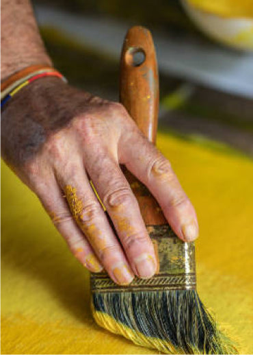
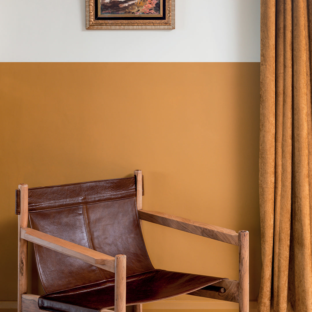
Using Tailored Tweedin the kitchen or living area introduces an earthy mustard gold to the space, offering a grounded yet intriguing design scheme. This warm, rich hue adds depth and sophistication while maintaining a sense of natural elegance. Tailor Tweed creates a cosy atmosphere and complements various textures and materials, making it an ideal choice for both vibrant and subdued colour palettes. Whether used on walls, cabinetry, or accents, this shade enhances the room’s character and warmth, striking a perfect balance between boldness and subtlety.

Brushed Goldused on the ceilings and Freehandon cabinetry creates a striking contrast that brings a touch of luxury and sophistication to any room. The subtle hint of teal combined with the gold adds a layer of visual interest, creating a space that is both elegant and full of character. The gold accentuates architectural features and adds a warm, reflective quality, while the teal introduces a cool, refreshing tone. Together, these elements craft a room that is vibrant and visually engaging, transforming it into a unique and memorable environment.

Shades likeRustling Leaves,Jam Tart, andDried Kelp are perfect for making a memorable impact in any room. By using thesecolours strategically forcolour blocking, you can frame key details and create striking visual effects. Rustling Leaves brings a natural, earthy elegance, Jam Tart adds vibrant energy, and Dried Kelp offers a muted, sophisticated tone. When appliedthoughtfully, these hues can transform your space, highlighting architectural features andcreating a dynamic, visually engaging environment.